Icon
Examples#
To browse and visualize all available icons, visit our icons browser
Basic Example#
import flet as ft
def main(page: ft.Page):
page.add(
ft.Row(
controls=[
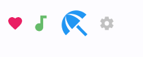
ft.Icon(name=ft.Icons.FAVORITE, color=ft.Colors.PINK),
ft.Icon(name=ft.Icons.AUDIOTRACK, color=ft.Colors.GREEN_400, size=30),
ft.Icon(name=ft.Icons.BEACH_ACCESS, color=ft.Colors.BLUE, size=50),
ft.Icon(name="settings", color="#c1c1c1"),
]
)
)
ft.run(main)
Bases: ConstrainedControl
Displays a Material icon.
| RAISES | DESCRIPTION |
|---|---|
AssertionError
|
If |
AssertionError
|
If |
AssertionError
|
If |
animate_offset: AnimationValue | None = None
animate_opacity: AnimationValue | None = None
animate_position: AnimationValue | None = None
animate_rotation: AnimationValue | None = None
animate_scale: AnimationValue | None = None
bottom: Number | None = None
The distance that the child's bottom edge is inset from the bottom of the stack.
Note
Effective only if this control is a descendant of one of the following:
Stack control, Page.overlay list.
col: ResponsiveNumber = 12
If a parent of this control is a ResponsiveRow,
this property is used to determine
how many virtual columns of a screen this control will span.
Can be a number or a dictionary configured to have a different value for specific
breakpoints, for example col={"sm": 6}.
This control spans the 12 virtual columns by default.
Dimensions
| Breakpoint | Dimension |
|---|---|
| xs | <576px |
| sm | ≥576px |
| md | ≥768px |
| lg | ≥992px |
| xl | ≥1200px |
| xxl | ≥1400px |
disabled: bool = False
Every control has disabled property which is False by default - control and all
its children are enabled.
Note
The value of this property will be propagated down to all children controls recursively.
expand_loose: bool = False
Allows the control to expand along the main axis if space is available, but does not require it to fill all available space.
More information here.
left: Number | None = None
The distance that the child's left edge is inset from the left of the stack.
Note
Effective only if this control is a descendant of one of the following:
Stack control, Page.overlay list.
name: IconValue
The name of the icon.
You can search through the list of all available icons using our Icons browser app written in Flet.
offset: OffsetValue | None = None
Applies a translation transformation before painting the control.
The translation is expressed as an Offset scaled to the control's size.
So, Offset(x=0.25, y=0), for example, will result in a horizontal translation
of one quarter the width of this control.
Example
The following example displays container at 0, 0 top left corner of a stack as
transform applies -1 * 100, -1 * 100 (offset * control's size) horizontal and
vertical translations to the control:
on_animation_end: (
    ControlEventHandler[ConstrainedControl] | None
) = None
Called when animation completes.
Can be used to chain multiple animations.
The data property of the event handler argument contains the name of the animation.
More information here.
opacity: Number = 1.0
Defines the transparency of the control.
Value ranges from 0.0 (completely transparent) to 1.0 (completely opaque
without any transparency).
parent: BaseControl | None
The direct ancestor(parent) of this control.
It defaults to None and will only have a value when this control is mounted
(added to the page tree).
The Page control (which is the root of the tree) is an exception - it always
has parent=None.
right: Number | None = None
The distance that the child's right edge is inset from the right of the stack.
Note
Effective only if this control is a descendant of one of the following:
Stack control, Page.overlay list.
rotate: RotateValue | None = None
Transforms this control using a rotation around its center.
The value of rotate property could be one of the following types:
number- a rotation in clockwise radians. Full circle360°ismath.pi * 2radians,90°ispi / 2,45°ispi / 4, etc.Rotate- allows to specify rotationangleas well asalignment- the location of rotation center.
scale: ScaleValue | None = None
Scales this control along the 2D plane. Default scale factor is 1.0, meaning no-scale.
Setting this property to 0.5, for example, makes this control twice smaller, while 2.0 makes it twice larger.
Different scale multipliers can be specified for x and y axis, by setting
Control.scale property to an instance of Scale class.
Either scale or scale_x and scale_y could be specified, but not all of them.
semantics_label: str | None = None
The semantics label for this icon.
It is not shown to the in the UI, but is announced in accessibility modes (e.g. TalkBack/VoiceOver).
size: Number | None = None
The icon's size.
Icons occupy a square with width and height equal to size.
Defaults to the nearest IconTheme.size.
If this Icon is being placed inside an IconButton, then use
IconButton.icon_size instead, so that the IconButton can make the splash
area the appropriate size as well. The IconButton uses an IconTheme to
pass down the size to the Icon.
tooltip: TooltipValue | None = None
The tooltip ot show when this control is hovered over.
top: Number | None = None
The distance that the child's top edge is inset from the top of the stack.
Note
Effective only if this control is a descendant of one of the following:
Stack control, Page.overlay list.
visible: bool = True
Every control has visible property which is True by default - control is
rendered on the page. Setting visible to False completely prevents control (and
all its children if any) from rendering on a page canvas. Hidden controls cannot be
focused or selected with a keyboard or mouse and they do not emit any events.
Called once during control initialization to define its child controls. self.page is available in this method.